The font I ended up using for my label (Oshawa car), is called Corpus Typewriter.
It is quite different from the Prestige Pica that HFR posted.
As I didn't have the original label to refer to, I scoured the site for another pic of an Oshawa label and came up with the ones below. When looking at typewriter fonts, I found the 3 and 4 on the Oshawa labels were different from some of the older typewriter fonts, and while not perfect, the Corpus matched the 3 better than others.
The label that Unruhjonny is working on has much different font than the Oshawa ones, so this info isn't really helpful to him but does show that there was variation from plant to plant and may help someone else.
Rabbit hole indeed!
https://www.azfonts.net/fonts/corpus...regular-314548
__________________
Michael
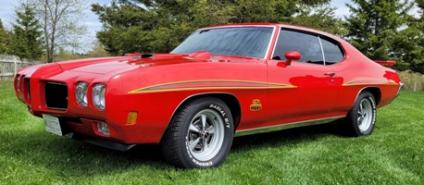
1970 Oshawa built 1 option Judge. 24 year restoration/upgrade project finally finished!
1979 Trans Am - low-buck drag car project for when I retire