I sent these mockups out to a few folks to verify accuracy. I'd love input on anything that looks off, but I think they're really close.
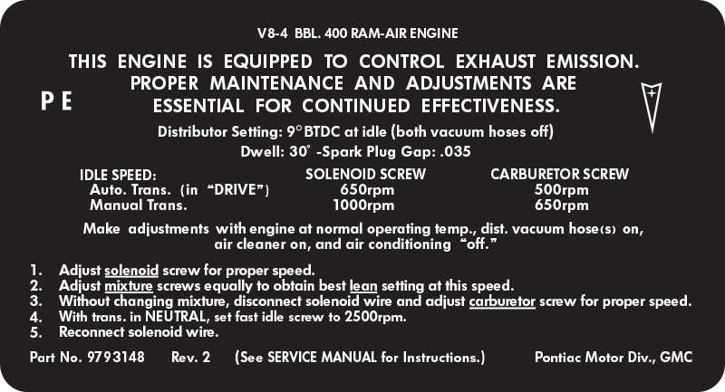
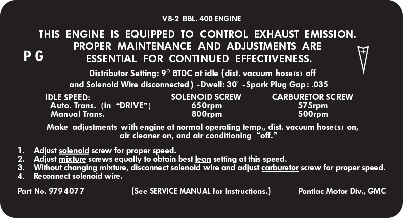
As I've been looking at originals, I'm seeing a slight variance in size and printing quality. The weight of the fonts on the stepped instructions has been challenging to match. It's not quite heavy or bold and medium is too light. I tried a number of version of Futura and settled on Demi Bold which splits the difference. Seems to be as close as it can get.
In the original mockup I destroked the fonts to give them a lighter appearance but when I output them I found that it slightly bungled the shapes of the letters. One of the details I got hung up on was the parenthesis and quotes - those are actually from a different font to match the original.
The irregular spacing between some words and letters is intentional to match the original, although exporting these and sizing them for the forum made some of the characters more funky than they would appear printed.
I've got a small pilot run of water slides in the works with the 400/428 4bbl decals. They will require a clear coat over them for durability. I think something like Krylon Crystal Clear or Eastwood's Diamond Clear would work well for that. Still investigating a version that would be a sticker, like the current repros.


__________________
Ken
'68 GTO - Ram Air II 464 - 236/242 roller - 9.5 TSP converter - 3.55 posi (
build thread |
walk around)
'95 Comp T/A #6 M6 - bone stock (
pics)