THE LOBBY A gathering place. Introductions, sports, showin' off your ride, birthday-anniversary-milestone, achievements, family oriented humor.

          
View Poll Results: Which logo do you like the best.
#1 45 41.67%
#2 38 35.19%
#3 11 10.19%
#4 2 1.85%
I like the old one better 11 10.19%
#7 Late new arrival 1 0.93%
Voters: 108. You may not vote on this poll

Reply
 
Thread Tools Display Modes
  #1  
Old 10-16-2018, 10:07 AM
Ccass's Avatar
Ccass Ccass is offline
Administrator
 
Join Date: Dec 1999
Location: Max Performance Hatfield, Pa
Posts: 4,693
Default Your host needs your Opinon

It's hard to believe that Pypes has been around for 15 years now. Many of you long time members may recall that Pypes got its start right here in the Pontiac community. Before Pypes was a brand, it was an accumulation of components assembled into a kit to fit the GTO. We had sourced a pair of tailpipes and X-pipe, added a choice of readily available mufflers from famous brands and sold them to many of you here on the PY Forums.

The PYPES name was soon after inspired by the PY forums. PY was short for Performance Years and seemed like an appropriate name for the forums. The 'PY' tag stuck and later the PYpes brand was born. . Otherwise, the company name would have been 'Pipes'!

Here was the initial announcement:

http://forums.maxperformanceinc.com/...d.php?t=428420

At some point, someone made the observation that PYPES stood for Performance Years Performance Exhaust Systems. Very clever but yours truly never even made that connection until someone brought it up to us years later.

Around 2005, we had a contest on these forums. We wanted a new name for our loudest muffler. One of our members came up with the winning name. 'Violator'. That muffler still remains one of our most popular mufflers.

Another marketing compliment we got was with our URL. http://pypesexhaust.com Many people citing how clever it was to put 'sex' in the middle as a subliminal reference. Again, I'd love to take credit for that but it was simply an accident.


Now to the reason for the trip back in time.....We think it's time to freshen up our logo. We'd like your opinion. Take a look at these logos and give us your vote.
Attached Thumbnails
Click image for larger version

Name:	Pypes logos 10-24-18.jpg
Views:	58
Size:	42.4 KB
ID:	495904  

__________________
---------------------------
Fool Around, Get Hurt, Don't come Crying to me.

Last edited by Ccass; 10-24-2018 at 04:20 PM.
  #2  
Old 10-16-2018, 10:19 AM
Chief of the 60's Chief of the 60's is offline
Suspended
 
Join Date: Nov 2017
Location: On the Rez
Posts: 3,233
Default

I went with number one. I have done a lot of advertising as well as signage and the rule of thumb always was "bold and bright", no dark colors. So IMO number 2 is out. You can see why just in the photo. Every one sticks out except 2. Now, if you change the red to yellow it might make a big difference.

  #3  
Old 10-16-2018, 10:40 AM
PurelyGTO68 PurelyGTO68 is offline
Chief Ponti-yacker
 
Join Date: Jul 2015
Posts: 792
Default

#1 has the most promise in my opinion.
Dark color on dark background is undesirable so #2 is not ideal unless you change the colors.

I like the simplicity of #1 because it is less dated and still communicates the product well (resembles bent tubing and laser CNC processes). The red tag line is unreadable on the dark background though....

Are you always going to have a dark background? If not, what colors are you using for white background?

Is there a reversed version?
Is it always stacked or is there a linear version?

Sent from my SM-G930V using Tapatalk

  #4  
Old 10-16-2018, 11:09 AM
The Champ's Avatar
The Champ The Champ is offline
Ultimate Warrior
 
Join Date: May 2002
Location: Rochester, MN
Posts: 2,540
Default

#2 is the best logo design, IMHO.

You could play with the colors to make some people happy if needed. But the actual design is a keeper. It looks like an exhaust.

  #5  
Old 10-16-2018, 11:21 AM
goatless's Avatar
goatless goatless is offline
Ultimate Warrior
 
Join Date: Nov 2002
Location: Newtown,CT
Posts: 4,592
Default

#1 is the way to go. It looks like the evolution of the original logo- which is good for brand recognition. The little streak/star burst at the bottom gives it dynamic motion and suggests the image of an exhaust.

Not a fan of #2, no matter what the color. The big circle, while I understand that it is supposed to represent an exhaust, just looks like a big knob hanging off the logo.

__________________
1966 GTO
1969 Lemans Convertible- F.A.S.T. legal family cruiser. 12.59 on G70-14 Polyglas tires. 1.78 60'
1969 Bonneville Safari- cross country family cruiser. .
1979 Trans Am 400, 4-speed, 4 wheel disc.

View from the drivers seat racing down Atco Raceway- http://www.youtube.com/watch?v=GhYDMdOEC7A

Ride along in the other lane-http://www.youtube.com/watch?v=mIzgpLtF_uw
  #6  
Old 10-16-2018, 11:22 AM
vwmailman vwmailman is offline
Senior Chief
 
Join Date: Oct 2004
Location: Scott, Ohio
Posts: 368
Default

I like #1.

  #7  
Old 10-16-2018, 11:37 AM
GT182's Avatar
GT182 GT182 is offline
Ultimate Warrior
 
Join Date: Aug 2007
Location: New Castle, Delaware - Member of POFC
Posts: 8,834
Default

My pick is #2, but with yellow instead of red. More "flash" to get their attention as it stands out more and makes them take a closer look.

__________________


Gary
Get in, ShuT Up, Hang On!
Member of the Baltimore Built Brotherhood
MY GTO built 4th Week of March 1966
"Crusin' Is Not A Crime"
Keep yer stick on the ice.
  #8  
Old 10-16-2018, 11:38 AM
Chris65LeMans's Avatar
Chris65LeMans Chris65LeMans is offline
Ultimate Warrior
 
Join Date: May 2013
Location: Los Angeles, CA
Posts: 1,598
Default

#2, but color the letters and pipe yellow. The others remind me of the ‘80’s Sears logo.

__________________
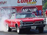
1965 Pontiac LeMans. M21, 3.73 in a 12 bolt, Kauffman 461.
  #9  
Old 10-16-2018, 12:07 PM
GT182's Avatar
GT182 GT182 is offline
Ultimate Warrior
 
Join Date: Aug 2007
Location: New Castle, Delaware - Member of POFC
Posts: 8,834
Default

Quote:
Originally Posted by Chris65LeMans View Post
The others remind me of the ‘80’s Sears logo.
I'm glad you said that not me. But... I was thinking it too. LOL

__________________


Gary
Get in, ShuT Up, Hang On!
Member of the Baltimore Built Brotherhood
MY GTO built 4th Week of March 1966
"Crusin' Is Not A Crime"
Keep yer stick on the ice.
  #10  
Old 10-16-2018, 12:18 PM
PunchT37's Avatar
PunchT37 PunchT37 is offline
Ultimate Warrior
 
Join Date: Dec 2002
Location: Lafayette,LA
Posts: 3,267
Default

Number 2 with a color change should grab more attention.

  #11  
Old 10-16-2018, 12:25 PM
Ccass's Avatar
Ccass Ccass is offline
Administrator
 
Join Date: Dec 1999
Location: Max Performance Hatfield, Pa
Posts: 4,693
Default

Quote:
Originally Posted by PurelyGTO68 View Post
Are you always going to have a dark background? If not, what colors are you using for white background?

Is there a reversed version?

Sent from my SM-G930V using Tapatalk
There will be a reversed version for placement on white background. Adding 4 with white background to the poll would have caused a lot of indecision. Some viewers would like one logo over another just because of it being on a white background.

__________________
---------------------------
Fool Around, Get Hurt, Don't come Crying to me.
  #12  
Old 10-16-2018, 12:28 PM
Ccass's Avatar
Ccass Ccass is offline
Administrator
 
Join Date: Dec 1999
Location: Max Performance Hatfield, Pa
Posts: 4,693
Default

Quote:
Originally Posted by Chris65LeMans View Post
#2, but color the letters and pipe yellow. The others remind me of the ‘80’s Sears logo.
That hurts....in light of Sear's recent bankruptcy announcement.


If you look at the Sears logo, it's got very old block letters and the swoop is curved like it was hand written. Side by side, I don't see the similarity but that's why we posted these logos!

__________________
---------------------------
Fool Around, Get Hurt, Don't come Crying to me.
  #13  
Old 10-16-2018, 01:05 PM
Ccass's Avatar
Ccass Ccass is offline
Administrator
 
Join Date: Dec 1999
Location: Max Performance Hatfield, Pa
Posts: 4,693
Default

I just uploaded a new image file that contains our original logo and the current logo.

__________________
---------------------------
Fool Around, Get Hurt, Don't come Crying to me.
  #14  
Old 10-16-2018, 01:06 PM
61-63 61-63 is offline
Suspended
 
Join Date: Jun 2001
Location: Sour Lake, Texas
Posts: 2,401
Default

#1 imo

  #15  
Old 10-16-2018, 01:11 PM
Bob with the 66's Avatar
Bob with the 66 Bob with the 66 is offline
Ultimate Warrior
 
Join Date: Jan 2003
Location: Motor city outsider, MI
Posts: 1,128
Default

Quote:
Originally Posted by 61-63 View Post
#1 imo
X2,

__________________
"Artificial intelligence is no match for natural stupidity".

1966 GTO Post Coupe, 467ci. N/A Pump gas, best 1/4 11.6 118mph
1966 GTO Post Coupe, "The Bright Idea" 535ci. N/A Pump gas, best 1/4 9.58 141mph
  #16  
Old 10-16-2018, 01:14 PM
The Champ's Avatar
The Champ The Champ is offline
Ultimate Warrior
 
Join Date: May 2002
Location: Rochester, MN
Posts: 2,540
Default

Quote:
Originally Posted by Chris65LeMans View Post
#2, but color the letters and pipe yellow. The others remind me of the ‘80’s Sears logo.
This was the Sears logo from 1966 - 1984. I fail to see any similarities.


Here is the one they replaced it with from 1984 - 1994. A little closer, but not much.


  #17  
Old 10-16-2018, 01:20 PM
TAKerry TAKerry is offline
Ultimate Warrior
 
Join Date: Feb 2018
Location: North Eastern MD
Posts: 1,157
Default

I voted for #2, it stands out a bit from the others.

  #18  
Old 10-16-2018, 01:21 PM
Firedup6975's Avatar
Firedup6975 Firedup6975 is offline
Moderator
 
Join Date: Jul 2005
Location: Q-T
Posts: 1,233
Default

#1 it’s crisp and clean and to the point. What the heck, now I’m gonna need a new Pypes hat. Lol

__________________
"BIG DADDY" VIDEO http://www.youtube.com/watch?v=QnFIVLuwO9A

~MaryAnn~ AKA "Stickybuns"
1969 Firebird 400 Convertible
1978 Bandit T/A Tribute
1977 RED TA


I'm the FiredUp PY bad girl
  #19  
Old 10-16-2018, 01:23 PM
Bob's GTO Bob's GTO is offline
Member
 
Join Date: Oct 2012
Location: Southeast PA
Posts: 78
Default

Number 2, but change the red to yellow.
I think that would really stand out on the side of a Pro Stock car.

  #20  
Old 10-16-2018, 01:28 PM
68 461 Bird 68 461 Bird is offline
Member
 
Join Date: Jan 2018
Posts: 86
Default

I like the flames, leave it alone.

Reply


Posting Rules
You may not post new threads
You may not post replies
You may not post attachments
You may not edit your posts

BB code is On
Smilies are On
[IMG] code is On
HTML code is Off

Forum Jump


All times are GMT -4. The time now is 07:01 PM.


About Us

The PY Online Forums is the largest online gathering of Pontiac enthusiasts anywhere in the world. Founded in 1991, it was also the first online forum for people to gather and talk about their Pontiacs. Since then, it has become the mecca of Pontiac technical data and knowledge that no other place can surpass.


Copyright © 2017